Introduction
Figma has become one of the most popular tools for UI and UX design. One common question that arises among designers is whether Figma is better suited for use on PCs or mobile screens. This blog aims to uncover the strengths and limitations of using Figma on these platforms, helping you decide which device is ideal for your design workflow.
Overview: Figma’s Versatility
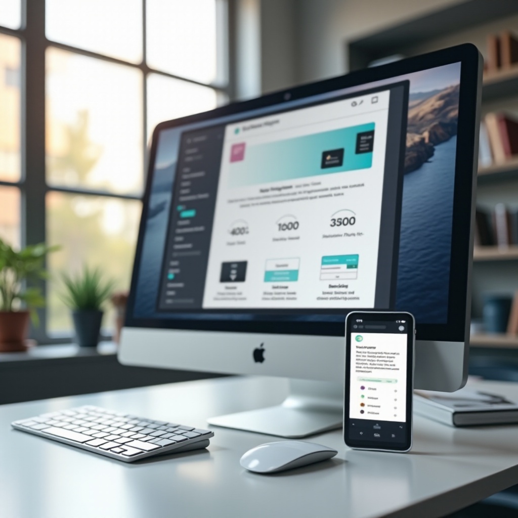
Figma is known for its flexibility and cloud-based nature, allowing designers to collaborate in real-time no matter which device they are using. This versatility makes it a highly sought-after tool in the design community. Whether drafting wireframes, creating prototypes, or sharing design files with collaborators, Figma offers a comprehensive suite of features that function smoothly on both PCs and mobile devices.
While Figma is primarily a desktop-based web application, it also has robust mobile capabilities. Yet, the user experience can differ significantly between these platforms. To assess its effectiveness, we need to explore how Figma operates within the contexts of PC and mobile screens.
PC vs. Mobile Screen: Key Differences
The core difference between using Figma on a PC and a mobile device is the interface and available functionalities. PCs, with their larger screens and more powerful processors, accommodate the full range of Figma’s features. This allows for detailed and intricate design tasks, seamless multitasking, and more manageable collaboration sessions.
On mobile devices, Figma’s app focuses on providing accessibility rather than full functionality. The mobile interface is optimized for reviewing designs and making minor adjustments on-the-go. However, actions requiring precision and extensive keyboard use are less efficient on smaller screens.
Understanding these distinctions is essential for leveraging Figma effectively across different devices.
Pros and Cons of Using Figma on PC
Using Figma on a PC comes with numerous advantages, but it is not without some limitations.
Pros:
1. Full Access to Features: All of Figma’s design tools are fully available on PC.
2. Larger Screen Real Estate: Enhanced spatial navigation and effective multitasking.
3. Keyboard Shortcuts: Expedite tasks and streamline workflows.
4. Better Processing Power: Handles complex designs and multiple projects seamlessly.
Cons:
1. Mobility Issues: PC use limits design work to specific locations.
2. Power Dependence: Requires a power source, reducing portability.
Whether for developing detailed elements or handling multiple files, PCs offer a more comprehensive platform for Figma use.

Pros and Cons of Using Figma on Mobile Devices
While Figma on mobile devices provides several conveniences, it also comes with its own set of challenges.
Pros:
1. Portability: Design anytime and anywhere.
2. Quick Reviews and Edits: Ideal for on-the-go tweaks and feedback.
3. Intuitive Touch Interface: Useful for pinching, zooming, and swiping.
Cons:
1. Limited Functionality: Not all Figma tools are available.
2. Small Screen Size: Difficulties with detailed tasks.
3. Lack of Precision: Limited by touch controls which lack the accuracy of a mouse.
Mobile devices are best suited for review, minor edits, and providing quick feedback during meetings or while traveling.
Optimizing Mobile Screens with Figma
Creating designs specifically for mobile screens is an increasingly essential part of the user experience design process. Figma provides specific tools and features that help ensure mobile interfaces are both functional and visually appealing.
Tools and Features for Mobile Design
- Frame Presets for Devices: Easily switch between different device views.
- Interactive Prototyping: Create and test mobile interactions.
- Vector Networks: Allow precision in icon and micro-interaction design.
- Component Libraries: Reuse components to ensure consistency across your mobile designs.
- Constraints and Auto Layout: Simplify responsive design and adaptability.
Tips for Best Practices
- Start with a Mobile-First Approach: Plan your design with smaller screens in mind first.
- Use Touch-Friendly Targets: Ensure elements are easily tappable.
- Optimize for Performance: Design assets that load quickly on mobile devices.
- Test Regularly: Prototype and user test frequently to catch any usability issues early.
- Responsive Design: Use constraints and auto-layout features to make designs adaptable.
Real-world Examples
- Instagram: Utilized Figma’s prototyping tools to refine its interface with intuitive, interactive elements.
- Spotify: Used frame presets to ensure a seamless user experience across various mobile devices.
- Airbnb: Leveraged component libraries to maintain a consistent UI across different screen sizes.
Conclusion
Figma is an incredibly flexible tool that caters well to both PC and mobile screens. While PCs are optimal for comprehensive design tasks due to their full functionality and expansive interface, mobile screens are excellent for quick edits and immediate feedback. Both platforms have their own sets of advantages and limitations, so it’s crucial to choose the one that best fits your design needs and workflow.
Frequently Asked Questions
Can I use Figma on both PC and mobile platforms efficiently?
Yes, Figma can be efficiently used on both PCs and mobile devices. PCs offer comprehensive design tools, while mobile devices provide the flexibility for on-the-go reviews and minor adjustments.
Are there any specific plugins for mobile interface design in Figma?
Yes, there are several Figma plugins designed to enhance mobile interface design, such as Auto Layout, Find and Replace, and Content Reel.
What is the best approach for a mobile-first design in Figma?
The best approach is to start with smaller screen designs and gradually add features for larger screens. Use touch-friendly targets and prototype consistently to test design effectiveness across different devices.